2b: Introduction to panel data versioning and nowcasting
Source:vignettes/02.1-nowcasting-demo.Rmd
02.1-nowcasting-demo.RmdIntroduction
This vignette walks through a minimal baseline nowcasting workflow
using the baselinenowcast and epinowcast
packages. We focus on weekly confirmed hospital admissions attributed to
influenza in Maryland and illustrate how to: - retrieve revision-aware
surveillance data, - build a reporting triangle, - estimate a reporting
delay distribution, and - generate a deterministic point nowcast that
corrects for under-reporting.
We repeat these steps with data from the baselinenowcast documentation.
Setup
We assume you have followed the first guide of this course, and have an API key ready for the DELPHI Epidata API.
epidatr::get_api_key()We will nowcast the confirmed hospital admission for influenza in Maryland. We specify the date at which we are nowcasting, and the date with the final data for evaluation.
state_name <- "Maryland"
geo_values <- "md"
forecast_disease <- "influenza"
nowcast_date = "2025-02-10"
eval_date = "2025-03-21"
Load the required packages.
Retrieve and Prepare Surveillance Data
Use epidatr::pub_covidcast() to pull National Healthcare
Safety Network (NHSN) hospital admission data for the selected disease
and location. The data are returned with revision tracking
(issue) that we rely on for nowcasting.
  # Map disease names to NHSN signal names
  # Based on epidatr NHSN signals for respiratory diseases
  signal_map <- list(
    "influenza" = "confirmed_admissions_flu_ew",
    "covid" = "confirmed_admissions_covid_ew",
    "rsv" = "confirmed_admissions_rsv_ew"
  )
  signal <- signal_map[[forecast_disease]]

  # Call epidatr to get the data
  epidata <- epidatr::pub_covidcast(
    source = "nhsn",
    signals = signal,
    geo_type = "state",
    time_type = "week",
    geo_values = tolower(geo_values),
    issues = "*"
  )
## Warning: No API key found. You will be limited to non-complex queries and encounter rate
## limits if you proceed.
## ℹ See `?save_api_key()` for details on obtaining and setting API keys.
## This warning is displayed once every 8 hours.
  target_data <- epidata |>
    select(
      location = geo_value,
      reference_date = time_value,
      report_date = issue,
      confirm = value
    ) |>
    epinowcast::enw_filter_report_dates(latest_date = eval_date) |>
    epinowcast::enw_filter_reference_dates(latest_date = nowcast_date)

    target_data$report_date %>% unique()
## [1] "2024-11-17" "2024-11-24" "2024-12-01" "2024-12-08" "2024-12-15"
## [6] "2024-12-22" "2024-12-29" "2025-01-05" "2025-01-12" "2025-01-19"
## [11] "2025-01-26" "2025-02-02" "2025-02-09" "2025-02-16" "2025-02-23"
## [16] "2025-03-02" "2025-03-09" "2025-03-16"Here we have transformed the data so it is in the format for
epinowcast, with columns * reference_date the date of the
observation, in this example the date of an incident influenza admission
in a hospital * report_date: the date of report for a given
set of observations by reference date * confirm: the total
(i.e. cumulative) number of hospitalisations by reference date and
report date.
target_data## location reference_date report_date confirm
## <char> <IDat> <IDat> <num>
## 1: md 2020-08-02 2024-11-17 NA
## 2: md 2020-08-02 2024-11-24 NA
## 3: md 2020-08-02 2024-12-01 NA
## 4: md 2020-08-02 2024-12-08 NA
## 5: md 2020-08-02 2024-12-15 NA
## ---
## 4171: md 2025-02-09 2025-02-16 1035
## 4172: md 2025-02-09 2025-02-23 1081
## 4173: md 2025-02-09 2025-03-02 1081
## 4174: md 2025-02-09 2025-03-09 1081
## 4175: md 2025-02-09 2025-03-16 1081Create two views of the data: the real-time version available on the
nowcast date and the final version used for evaluation. This use very
convenient filtering functions in epinowcast. The epinowcast function
epinowcast::enw_latest_data() filters observations to keep
only the latest available reported total counts for each reference date.
The epinowcast function
epinowcast::enw_filter_report_dates() is used to create a
truncated dataset for generating a retrospective nowcast, using the data
that would have been available as of the nowcast date.
observed_data <- epinowcast::enw_filter_report_dates(target_data, latest_date = nowcast_date)
obs_by_reference <- epinowcast::enw_latest_data(observed_data)

latest_data <- epinowcast::enw_latest_data(target_data) |>
  epinowcast::enw_filter_reference_dates(latest_date = max(observed_data$reference_date))
Let’s plot our two datasets, the red line shows the total number of confirmed admissions on each reference date, across all delays, using the data available at the nowcast date, whereas the blackline show the final value of the data.
obs_data_by_reference_date <- epinowcast::enw_latest_data(observed_data)

plot_data <- ggplot() +
  geom_line(
    data = obs_data_by_reference_date,
    aes(x = reference_date, y = confirm), color = "darkred"
  ) +
  geom_line(
    data = latest_data,
    aes(x = reference_date, y = confirm), color = "black"
  ) +
  theme_bw() +
  xlab("Reference date") +
  ylab(signal) +
  #scale_y_continuous(trans = "log10") +
  xlim(as.Date("2024-11-01"), as.Date(nowcast_date))
  ggtitle("Comparing real-time and later observed cases")
## <ggplot2::labels> List of 1
## $ title: chr "Comparing real-time and later observed cases"
plot_data## Warning: Removed 222 rows containing missing values or values outside the scale range
## (`geom_line()`).
## Removed 222 rows containing missing values or values outside the scale range
## (`geom_line()`).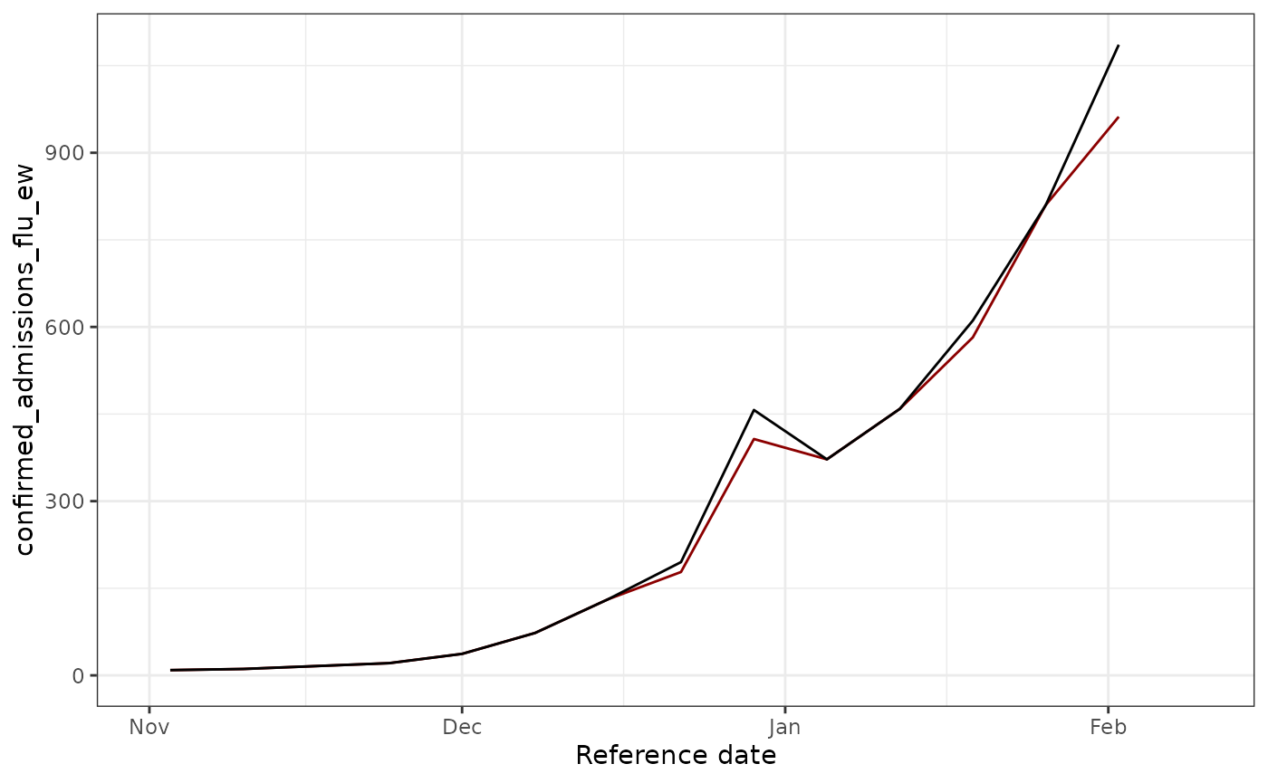 We see that some revision occurred ! Let’s try to fix these.
Visualizing all versions on the same plot
Now let’s create a plot showing all different report date versions in different colors on the same graph. This helps us understand how the data evolved over time as new reports came in.
# Get all unique report dates to create snapshots
all_report_dates <- target_data %>%
  pull(report_date) %>%
  unique() %>%
  sort()

# Create a dataframe with the latest data available as of each report date
# Using epinowcast::enw_latest_data() to properly get the latest value for each reference date
all_versions <- map_dfr(all_report_dates, function(rd) {
  target_data %>%
    epinowcast::enw_filter_report_dates(latest_date = rd) %>%
    epinowcast::enw_latest_data() %>%
    mutate(version = rd)
})

# Create plot with all versions in different colors
ggplot(all_versions, aes(x = reference_date, y = confirm, color = as.factor(version))) +
  geom_line(linewidth = 0.8) +
  theme_bw() +
  xlab("Reference date") +
  ylab(signal) +
  labs(
    title = "All Data Versions by Report Date",
    subtitle = "Each color represents the data as it appeared on a different report date",
    color = "Report Date"
  ) +
  scale_color_viridis_d(option = "D", end = 0.9) +
  theme(legend.position = "right",
        legend.key.height = unit(0.4, "cm")) +
  xlim(as.Date("2024-11-01"), as.Date(nowcast_date))
## Warning: Removed 3996 rows containing missing values or values outside the scale range
## (`geom_line()`).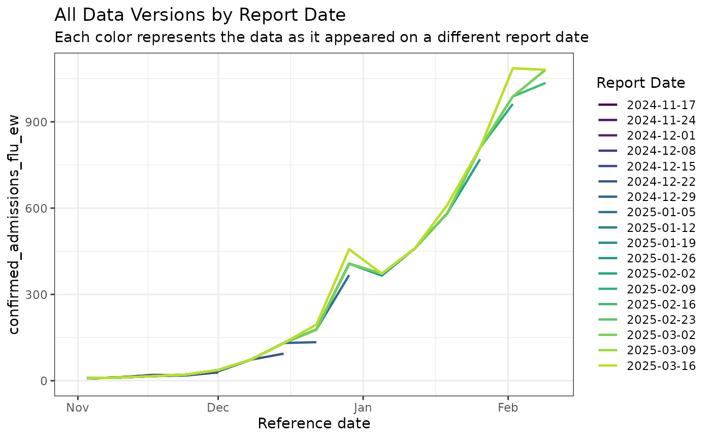
This plot shows how the reported values for each reference date changed over time as more complete data became available. Earlier versions (earlier colors in the legend) show lower values due to reporting delays, while later versions show progressively higher and more complete counts.
Build the Reporting Triangle
Restrict the data to a training window and construct the reporting triangle, which stores rows of reference weeks and columns of reporting delays.
# Empirical data outside this delay window will not be used for training
max_delay <- 4 # weeks
n_training_volume <- 8*7 # days (30 weeks)
Next we will use the epinowcast function,
epinowcast::enw_filter_reference_dates() to filter to only
include n_training_volume days of historical data, and the epinowcast
function epinowcast::enw_latest_data() will be used to
filter for the latest available reported total counts for each reference
date. Finally to obtain the data we want to evaluate the forecasts
against, we will use epinowcast::enw_filter_reference_dates() applied to
the target_data, to filter it for only the n_training_volume days of
historical data.
training_data <- epinowcast::enw_filter_reference_dates(observed_data, include_days = n_training_volume)

latest_training_data <- epinowcast::enw_latest_data(training_data)

eval_data <- epinowcast::enw_filter_reference_dates(latest_data, include_days = n_training_volume-1)
pobs <- epinowcast::enw_preprocess_data(
  obs = training_data,
  max_delay = max_delay+2,
  timestep="week",
  set_negatives_to_zero = TRUE
)
## Warning: The coverage of the specified maximum delay could not be reliably checked.
## • There are only very few (4) reference dates that are sufficiently far in the
## past (more than 27 days) to compute coverage statistics for the maximum
## delay.
## • You can test different maximum delays and obtain coverage statistics using
## the function check_max_delay() (`?epinowcast::check_max_delay()`).
reporting_triangle_df <- select(
  pobs$new_confirm[[1]],
  reference_date,
  delay,
  new_confirm
)

reporting_triangle <- reporting_triangle_df |>
  pivot_wider(names_from = delay, values_from = new_confirm) |>
  select(-reference_date) |>
  as.matrix()

reporting_triangle[is.na(reporting_triangle)] <- 0

reporting_triangle
## 0 1 2 3 4
## [1,] 94 37 0 0 0
## [2,] 134 44 0 0 0
## [3,] 367 40 0 0 0
## [4,] 366 0 0 6 0
## [5,] 459 0 0 0 0
## [6,] 582 0 0 0 0
## [7,] 770 40 0 0 0
## [8,] 962 0 0 0 0Look at the output of the triangle, what do you notice ?
Inspect the reporting triangle using a heat map.
#### code to plot:
triangle_df <- as.data.frame(reporting_triangle) |>
mutate(time = row_number()) |>
pivot_longer(!time,
values_to = "count",
names_prefix = "V",
names_to = "delay"
) |>
mutate(delay = as.numeric(delay))
plot_triangle <- ggplot(
triangle_df,
aes(x = delay, y = time, fill = count)
) +
geom_tile() +
scale_fill_gradient(low = "white", high = "red") +
labs(title = "Reporting triangle", x = "Delay", y = "Time") +
theme_bw() +
scale_y_reverse()
plot_triangle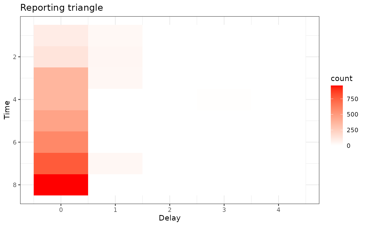 Here, the grey indicates matrix elements that are NA, which we would
expect to be the case in the bottom right portion of the reporting
triangle where the counts have yet to be observed.
Here, the grey indicates matrix elements that are NA, which we would
expect to be the case in the bottom right portion of the reporting
triangle where the counts have yet to be observed.
Estimate Delay and Generate Point Nowcasts
We use half of the available reference weeks to estimate the delay distribution and reserve the remaining weeks for evaluation.
# most recent 50% of the reference times for delay estimation
n_history_delay <- as.integer(0.5 * n_training_volume) # days

delay_pmf <- baselinenowcast::estimate_delay(
  reporting_triangle = reporting_triangle,
  max_delay = max_delay,
  n = n_history_delay/7
)


delay_df <- data.frame(
  delay = 0:(length(delay_pmf) - 1),
  pmf = delay_pmf
)

delay_cdf_plot <- ggplot(delay_df) +
  geom_line(aes(x = delay, y = cumsum(pmf))) +
  xlab("Delay") +
  ylab("Cumulative proportion reported") +
  ggtitle("Empirical point estimate of cumulative proportion reported by delay") + # nolint
  theme_bw()

delay_pmf_plot <- ggplot(delay_df) +
  geom_line(aes(x = delay, y = pmf)) +
  xlab("Delay") +
  ylab("Proportion reported") +
  ggtitle("Empirical point estimate of proportion reported by delay") +
  theme_bw()
Let’s plot the distribution of delays
delay_cdf_plot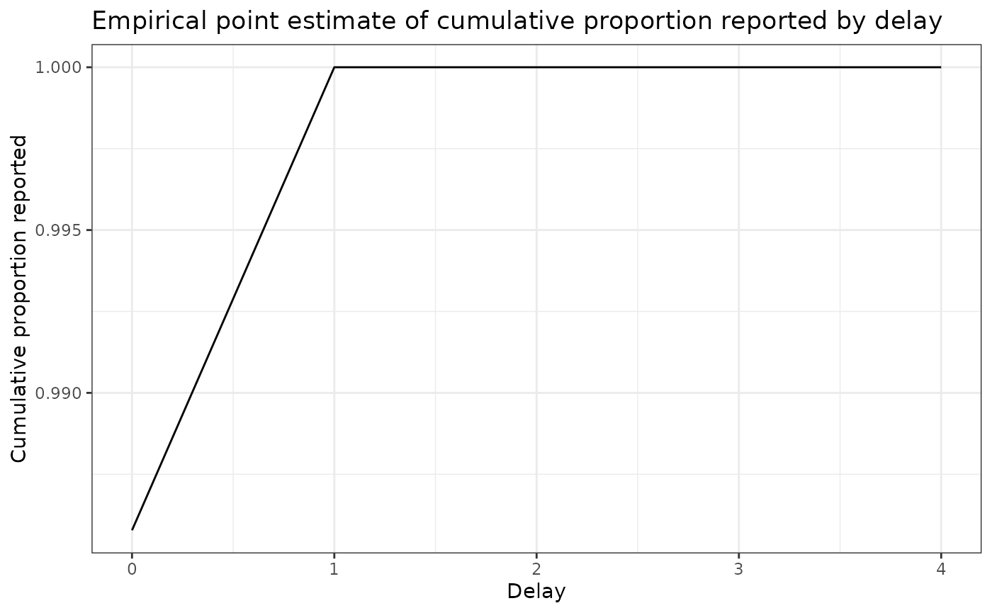
delay_pmf_plot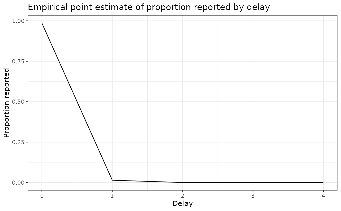
Apply the delay to generate a point nowcast
point_nowcast_matrix <- baselinenowcast::apply_delay(
  reporting_triangle = reporting_triangle,
  delay_pmf = delay_pmf
)

point_nowcast_df <- eval_data |>
  mutate(nowcast = rowSums(point_nowcast_matrix))

prep_latest_data <- latest_training_data |>
  mutate(type = "Real-time data") |>
  select(type, reference_date, count = confirm)
# Combine data into a single dataframe for plotting
plot_data <- point_nowcast_df |>
  pivot_longer(
    cols = c(confirm, nowcast),
    names_to = "type",
    values_to = "count"
  ) |>
  mutate(type = case_when(
    type == "confirm" ~ "Final observed data",
    type == "nowcast" ~ "Point nowcast",
    TRUE ~ type
  )) |>
  bind_rows(prep_latest_data)

# Create plot with data type as a variable
plot_pt_nowcast <- ggplot(plot_data, aes(
  x = reference_date,
  y = count,
  color = type,
  linetype = type
)) +
  geom_line() +
  scale_color_manual(values = c(
    "Real-time data" = "darkred",
    "Final observed data" = "black",
    "Point nowcast" = "darkblue"
  )) +
  scale_linetype_manual(values = c(
    "Real-time data" = "dashed",
    "Final observed data" = "dashed",
    "Point nowcast" = "solid"
  )) +
  theme_bw() +
  xlab("Reference date") +
  ylab("Confirmed admissions") +
  #scale_y_continuous(trans = "log10") +
  ggtitle("Comparing real-time, nowcasted, and later observed cases") +
  theme(legend.position = "bottom") +
  labs(color = "Type", linetype = "Type")
plot_pt_nowcast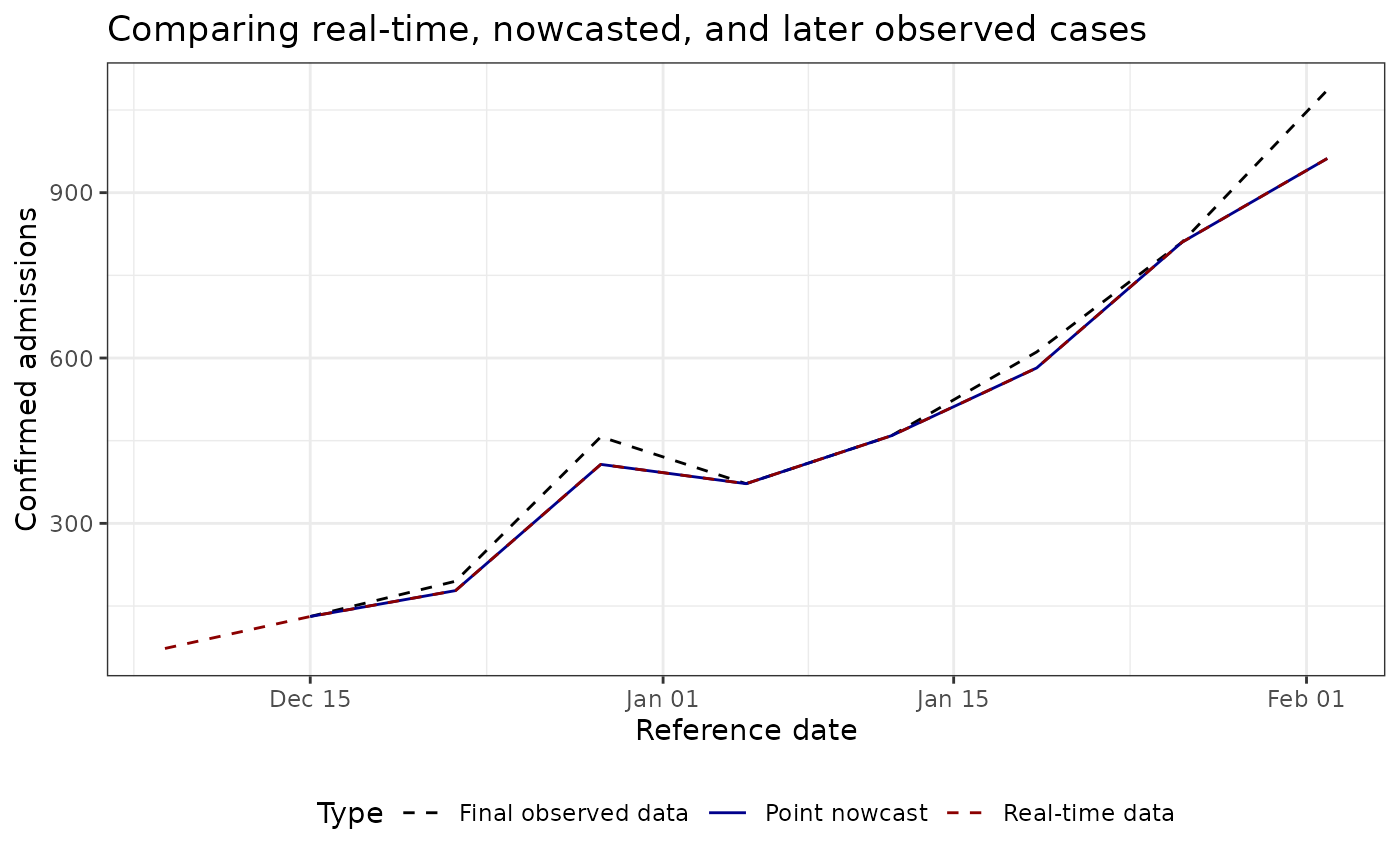
As you observe, this example is disappointing, as in this example the point nowcast (blue) sits almost exactly on top of the real-time observations (red). That behaviour aligns with the estimated delay distribution, which places nearly all probability mass on a zero-week delay for the most recent reference times.
Unfortunately, the NHSN signal currently exposed via Epidata only stores revisions back to late 2024-11-17, so we cannot draw on a longer training history to expose weeks with notable late reports.
Indeed, nowcasting is beneficial with a longer history of data (unfortnuataly epidata does not store NHSN issues before 2024-11-17), better nowcasting nodels.
To see larger adjustments, experiment with other locations, earlier nowcast dates, or datasets that contain richer revision patterns (for example the Robert Koch Institute line list available through the Germany Nowcasting Hub).
Next Steps
- Use
baselinenowcast::estimate_and_apply_uncertainty()to obtain probabilistic nowcast intervals if you need calibrated uncertainty estimates. - Adjust the training window (
n_training_weeks) ormax_delayto match the reporting dynamics of other diseases or locations. - Explore model variants documented in the baselinenowcast vignette for stratified data or alternative delay models.
a more interesting example
This section follow closely the Getting started of the baselinenowcast package
Dataset
We will work on a more interesting dataset: daily level data from the
Robert Koch Institute via the Germany Nowcasting hub. These data
represent hospital admission counts by date of positive test and date of
test report in Germany up to October 1, 2021. Filter the data to just
look at the national-level data, for all age groups. We will pretend
that we are making a nowcast as of August 1, 2021, therefore we will
exclude all reference dates and report dates from before that date.
germany_covid19_hosp is provided as package data from
epinowcast
nowcast_date <- "2021-08-01"
eval_date <- "2021-10-01"

target_data <- epinowcast::germany_covid19_hosp[location == "DE"][age_group == "00+"] |>
  epinowcast::enw_filter_report_dates(latest_date = eval_date) |>
  epinowcast::enw_filter_reference_dates(
    latest_date = nowcast_date
  )
latest_data <- epinowcast::enw_latest_data(target_data)
observed_data <- epinowcast::enw_filter_report_dates(
  target_data,
  latest_date = nowcast_date
)

head(observed_data)
## reference_date location age_group confirm report_date
## <IDat> <fctr> <fctr> <int> <IDat>
## 1: 2021-04-06 DE 00+ 149 2021-04-06
## 2: 2021-04-07 DE 00+ 312 2021-04-07
## 3: 2021-04-08 DE 00+ 424 2021-04-08
## 4: 2021-04-09 DE 00+ 288 2021-04-09
## 5: 2021-04-10 DE 00+ 273 2021-04-10
## 6: 2021-04-11 DE 00+ 107 2021-04-11Click to expand code to create the plot of the latest data
obs_data_by_reference_date <- epinowcast::enw_latest_data(observed_data)
plot_data <- ggplot() +
  geom_line(
    data = obs_data_by_reference_date,
    aes(x = reference_date, y = confirm), color = "darkred"
  ) +
  geom_line(
    data = latest_data,
    aes(x = reference_date, y = confirm), color = "black"
  ) +
  theme_bw() +
  xlab("Reference date") +
  ylab("Confirmed admissions") +
  scale_y_continuous(trans = "log10") +
  ggtitle("Comparing real-time and later observed cases")
plot_data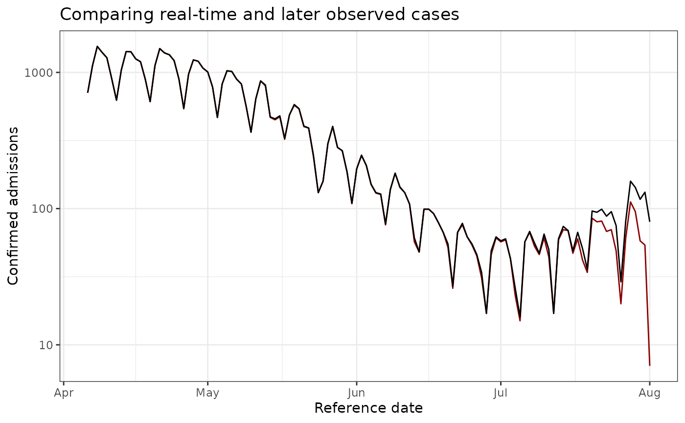
Visualizing all versions on the same plot (Germany data)
Let’s create the same visualization for the Germany dataset, showing all different report date versions in different colors.
# Get report dates - sample monthly to avoid too many versions
all_report_dates_germany <- target_data %>%
  pull(report_date) %>%
  unique() %>%
  sort()

# Select only the first day of each month (or closest available date)
monthly_report_dates <- all_report_dates_germany %>%
  as.Date() %>%
  tibble(date = .) %>%
  mutate(year_month = format(date, "%Y-%m")) %>%
  group_by(year_month) %>%
  slice_min(date, n = 1) %>%
  pull(date)

# Create a dataframe with the latest data available as of each monthly report date
# Using epinowcast::enw_latest_data() to properly get the latest value for each reference date
all_versions_germany <- map_dfr(monthly_report_dates, function(rd) {
  target_data %>%
    epinowcast::enw_filter_report_dates(latest_date = rd) %>%
    epinowcast::enw_latest_data() %>%
    mutate(version = rd)
})

# Create plot with all versions in different colors
ggplot(all_versions_germany, aes(x = reference_date, y = confirm, color = as.factor(version))) +
  geom_line(linewidth = 0.8) +
  theme_bw() +
  xlab("Reference date") +
  ylab("Confirmed admissions") +
  labs(
    title = "All Data Versions by Report Date (Germany COVID-19)",
    subtitle = "Monthly snapshots showing how the data evolved over time",
    color = "Report Date"
  ) +
  scale_color_viridis_d(option = "D", end = 0.9) +
  scale_y_continuous(trans = "log10") +
  theme(legend.position = "right",
        legend.key.height = unit(0.4, "cm"))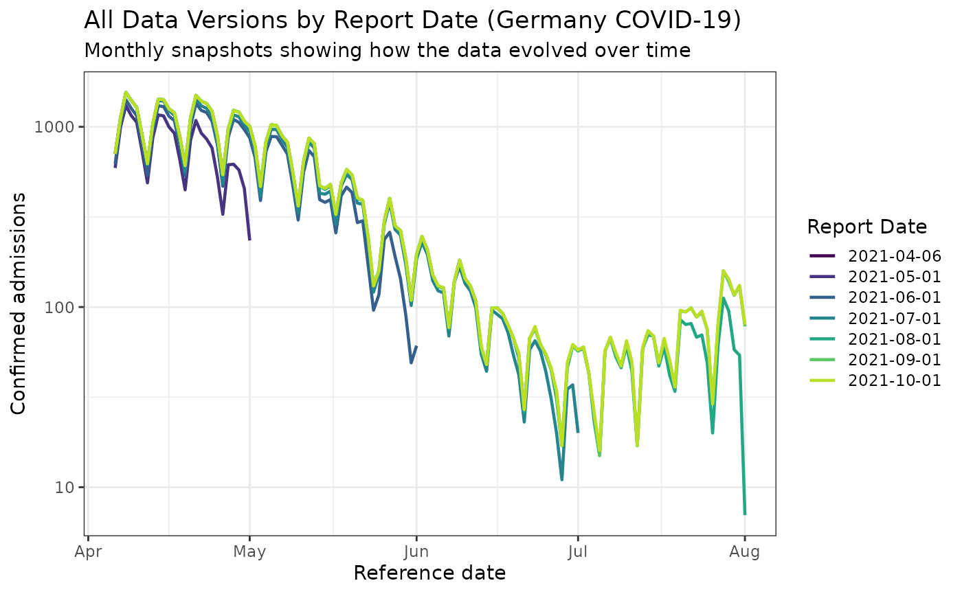
This visualization is much more interesting for the Germany dataset! You can clearly see how the reported values evolved significantly over time, with substantial revisions occurring as more complete data became available.
Let’s build the reporting triangle
max_delay <- 30
n_training_volume <- 3 * max_delay
n_history_delay <- as.integer(0.5 * n_training_volume)
training_data <- epinowcast::enw_filter_reference_dates(
  observed_data,
  include_days = n_training_volume - 1
)
latest_training_data <- epinowcast::enw_latest_data(training_data)
eval_data <- epinowcast::enw_filter_reference_dates(
  latest_data,
  include_days = n_training_volume - 1
)
pobs <- epinowcast::enw_preprocess_data(
  obs = training_data,
  max_delay = max_delay + 1
)
reporting_triangle_df <- select(
  pobs$new_confirm[[1]],
  reference_date,
  delay,
  new_confirm
)
reporting_triangle <- reporting_triangle_df |>
  pivot_wider(names_from = delay, values_from = new_confirm) |>
  select(-reference_date) |>
  as.matrix()
Click to expand code to create the plot of the reporting triangle
triangle_df <- as.data.frame(reporting_triangle) |>
  mutate(time = row_number()) |>
  pivot_longer(!time,
    values_to = "count",
    names_prefix = "V",
    names_to = "delay"
  ) |>
  mutate(delay = as.numeric(delay))

plot_triangle <- ggplot(
  triangle_df,
  aes(x = delay, y = time, fill = count)
) +
  geom_tile() +
  scale_fill_gradient(low = "white", high = "blue") +
  labs(title = "Reporting triangle", x = "Delay", y = "Time") +
  theme_bw() +
  scale_y_reverse()
plot_triangle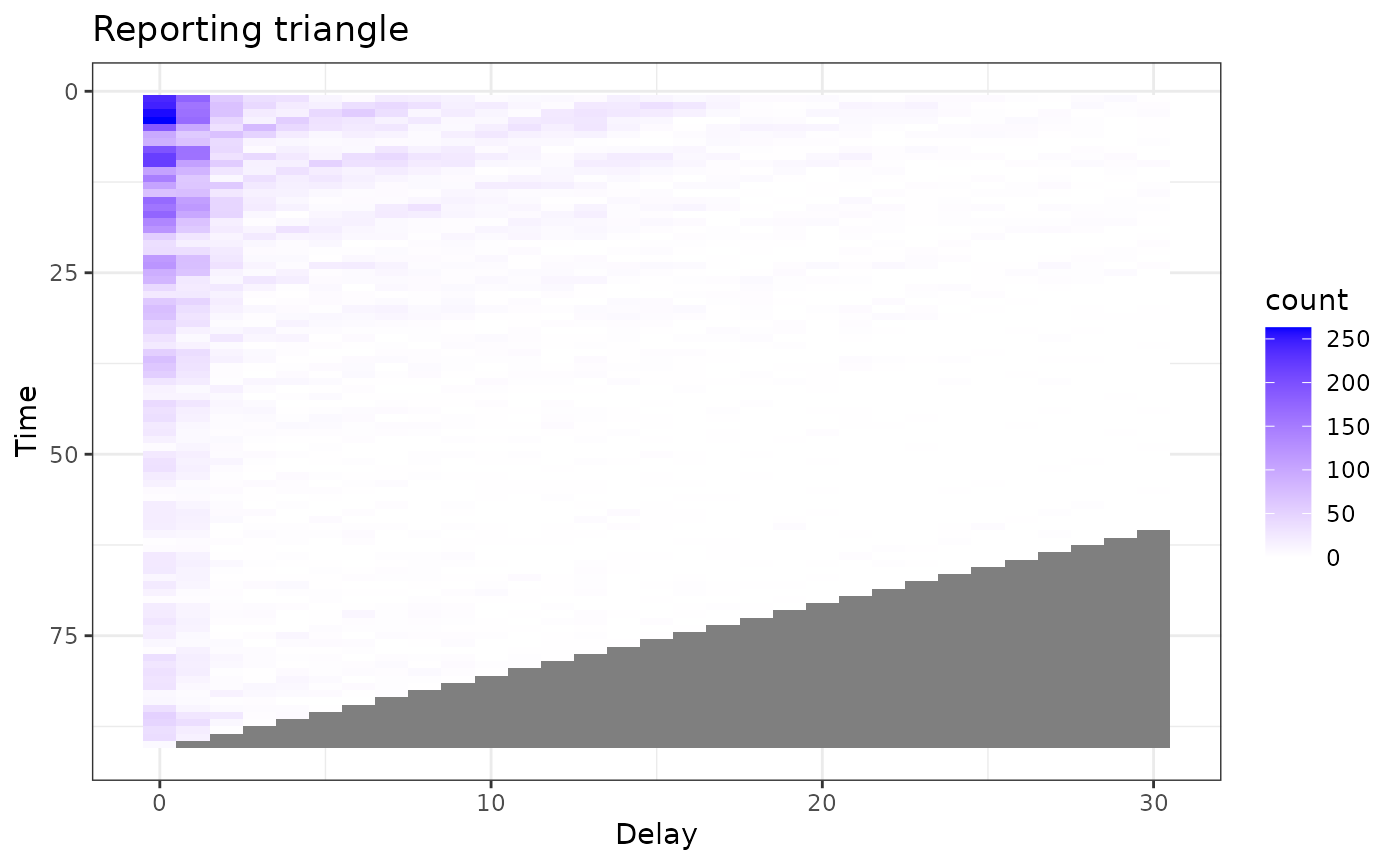 Much more interesting !!
Let’s estimate the delay
delay_pmf <- estimate_delay(
  reporting_triangle = reporting_triangle,
  max_delay = max_delay,
  n = n_history_delay
)
Click to expand code to create the plot of the delay distribution
delay_df <- data.frame(
  delay = 0:(length(delay_pmf) - 1),
  pmf = delay_pmf
)

delay_cdf_plot <- ggplot(delay_df) +
  geom_line(aes(x = delay, y = cumsum(pmf))) +
  xlab("Delay") +
  ylab("Cumulative proportion reported") +
  ggtitle("Empirical point estimate of cumulative proportion reported by delay") + # nolint
  theme_bw()

delay_pmf_plot <- ggplot(delay_df) +
  geom_line(aes(x = delay, y = pmf)) +
  xlab("Delay") +
  ylab("Proportion reported") +
  ggtitle("Empirical point estimate of proportion reported by delay") +
  theme_bw()
delay_cdf_plot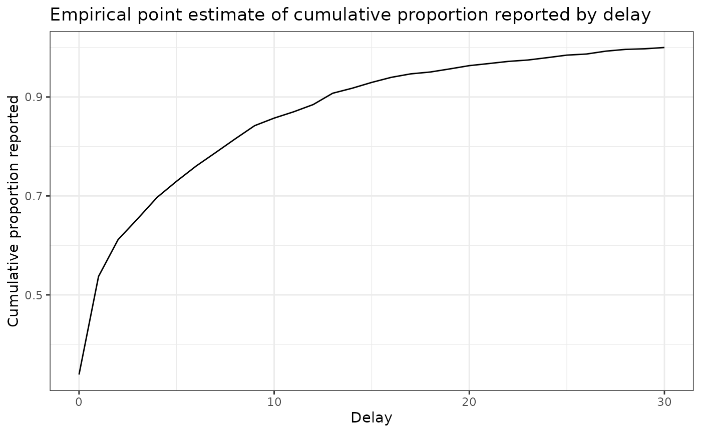
delay_pmf_plot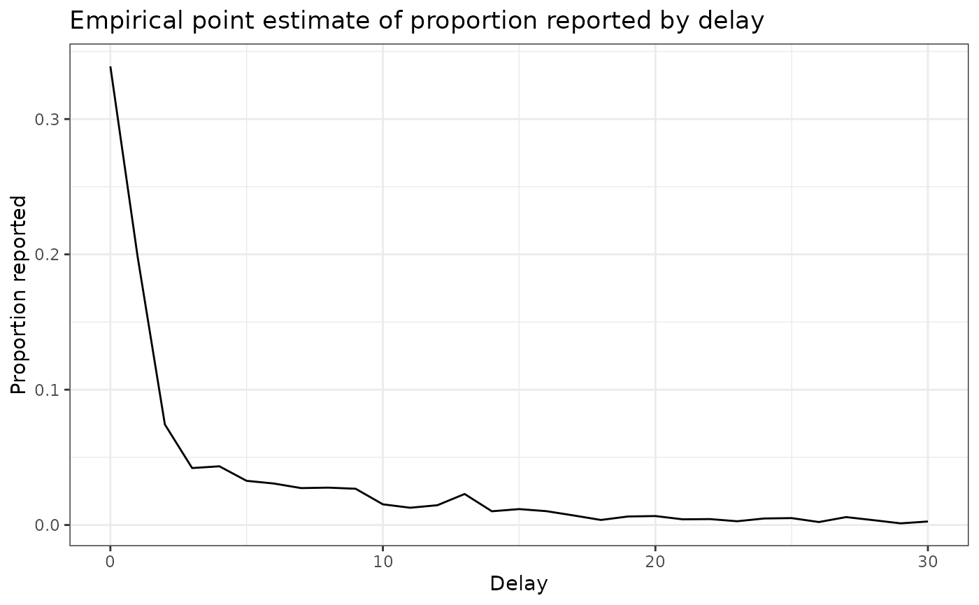
Generate nowcast with delay
point_nowcast_matrix <- baselinenowcast::apply_delay(
  reporting_triangle = reporting_triangle,
  delay_pmf = delay_pmf
)
Click to expand code to create the plot of the point nowcast
point_nowcast_df <- eval_data |>
  mutate(nowcast = rowSums(point_nowcast_matrix))

prep_latest_data <- latest_training_data |>
  mutate(type = "Real-time data") |>
  select(type, reference_date, count = confirm)
# Combine data into a single dataframe for plotting
plot_data <- point_nowcast_df |>
  pivot_longer(
    cols = c(confirm, nowcast),
    names_to = "type",
    values_to = "count"
  ) |>
  mutate(type = case_when(
    type == "confirm" ~ "Final observed data",
    type == "nowcast" ~ "Point nowcast",
    TRUE ~ type
  )) |>
  bind_rows(prep_latest_data)

# Create plot with data type as a variable
plot_pt_nowcast <- ggplot(plot_data, aes(
  x = reference_date,
  y = count,
  color = type
)) +
  geom_line() +
  scale_color_manual(values = c(
    "Real-time data" = "darkred",
    "Final observed data" = "black",
    "Point nowcast" = "darkblue"
  )) +
  theme_bw() +
  xlab("Reference date") +
  ylab("Confirmed admissions") +
  scale_y_continuous(trans = "log10") +
  ggtitle("Comparing real-time, nowcasted, and later observed cases") +
  theme(legend.position = "bottom") +
  labs(color = "Type")
plot_pt_nowcast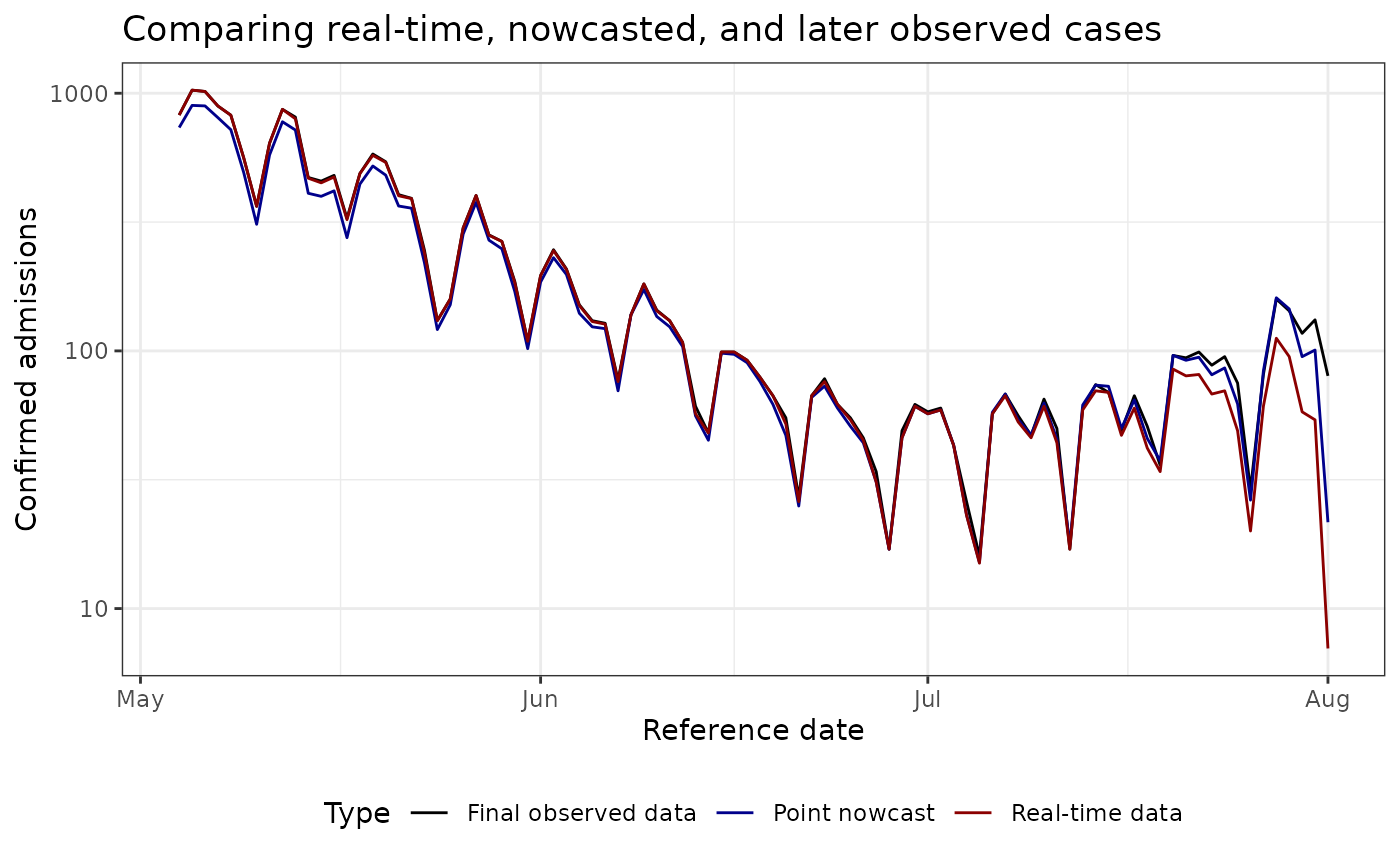
Estimate uncertainy
For uncertainty estimation, we will generate retrospective nowcast datasets with the most recent 50% of the reference times.
n_retrospective_nowcasts <- as.integer(0.5 * n_training_volume)


trunc_rep_tri_list <- baselinenowcast::truncate_triangles(reporting_triangle,
  n = n_retrospective_nowcasts
)
retro_rep_tri_list <- baselinenowcast::construct_triangles(trunc_rep_tri_list)

retro_pt_nowcast_mat_list <- baselinenowcast::fill_triangles(
  retro_reporting_triangles = retro_rep_tri_list,
  n = n_history_delay
)

disp_params <- baselinenowcast::estimate_uncertainty(
  point_nowcast_matrices = retro_pt_nowcast_mat_list,
  truncated_reporting_triangles = trunc_rep_tri_list,
  retro_reporting_triangles = retro_rep_tri_list,
  n = n_retrospective_nowcasts
)
nowcast_draws_df <- baselinenowcast::sample_nowcasts(
  point_nowcast_matrix, reporting_triangle,
  uncertainty_params = disp_params,
  draws = 100
)

head(nowcast_draws_df)
## pred_count time draw
## 1 736 1 1
## 2 897 2 1
## 3 893 3 1
## 4 804 4 1
## 5 722 5 1
## 6 492 6 1Vizualize probablistic nowcast
latest_data_prepped <- latest_training_data |>
  mutate(time = row_number()) |>
  rename(obs_confirm = confirm) |>
  mutate(reference_date = as.Date(reference_date))
# Prepare the final evaluation data so we can combine the datasets.

final_data_prepped <- eval_data |>
  select(reference_date, final_confirm = confirm) |>
  mutate(reference_date = as.Date(reference_date))
# Join the nowcasts, data as of the nowcast date, and the final data.
obs_with_nowcast_draws_df <- nowcast_draws_df |>
  left_join(latest_data_prepped, by = "time") |>
  left_join(final_data_prepped, by = "reference_date")
head(obs_with_nowcast_draws_df)
## pred_count time draw reference_date location age_group obs_confirm
## 1 736 1 1 2021-05-04 DE 00+ 823
## 2 897 2 1 2021-05-05 DE 00+ 1028
## 3 893 3 1 2021-05-06 DE 00+ 1016
## 4 804 4 1 2021-05-07 DE 00+ 892
## 5 722 5 1 2021-05-08 DE 00+ 822
## 6 492 6 1 2021-05-09 DE 00+ 561
## report_date final_confirm
## 1 2021-07-24 823
## 2 2021-07-25 1028
## 3 2021-07-26 1016
## 4 2021-07-27 892
## 5 2021-07-28 822
## 6 2021-07-29 561Click to expand code to create the plot of the probabilistic nowcast
# Create a separate dataframe for only the observed and final data, to make plotting easier.
combined_data <- obs_with_nowcast_draws_df |>
  select(reference_date, obs_confirm, final_confirm) |>
  distinct() |>
  pivot_longer(
    cols = c(obs_confirm, final_confirm),
    names_to = "type",
    values_to = "count"
  ) |>
  mutate(type = case_when(
    type == "obs_confirm" ~ "Observed data",
    type == "final_confirm" ~ "Final observed data"
  ))


# Plot with draws for nowcast only
plot_prob_nowcast <- ggplot() +
  # Add nowcast draws as thin gray lines
  geom_line(
    data = obs_with_nowcast_draws_df,
    aes(
      x = reference_date, y = pred_count, group = draw,
      color = "Nowcast draw", linewidth = "Nowcast draw"
    )
  ) +
  # Add observed data and final data once
  geom_line(
    data = combined_data,
    aes(
      x = reference_date,
      y = count,
      color = type,
      linewidth = type
    )
  ) +
  theme_bw() +
  scale_color_manual(
    values = c(
      "Nowcast draw" = "gray",
      "Observed data" = "darkred",
      "Final observed data" = "black"
    ),
    name = ""
  ) +
  scale_linewidth_manual(
    values = c(
      "Nowcast draw" = 0.2,
      "Observed data" = 1,
      "Final observed data" = 1
    ),
    name = ""
  ) +
  scale_y_continuous(trans = "log10") +
  xlab("Reference date") +
  ylab("Hospital admissions") +
  theme(legend.position = "bottom") +
  ggtitle("Comparison of admissions as of the nowcast date, later observed counts, \n and probabilistic nowcasted counts") # nolint
plot_prob_nowcast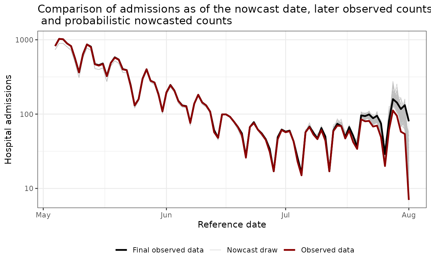
More ressources:
- Paulo Ventura’s archived NHSN exports: https://paulocv.github.io/respiratory_archive/
-
baselinenowcastgetting started guide: https://baselinenowcast.epinowcast.org/articles/baselinenowcast.html (and the accompanying paper: https://www.medrxiv.org/content/10.1101/2025.08.14.25333653v2) -
epinowcastintroduction for principled hierarchical nowcasting models: https://package.epinowcast.org/articles/epinowcast.html - Delphi Insight Net Workshop 2024 slide decks (see the first two sessions): https://cmu-delphi.github.io/insightnet-workshop-2024. Here the nowcasting is done using the scaling methods, but using another set of software tools
- SISMID NFIDD course notes on nowcasting: https://nfidd.github.io/sismid/
- Lison et al. review of the nowcasting literature: https://journals.plos.org/ploscompbiol/article?id=10.1371/journal.pcbi.1012021