-
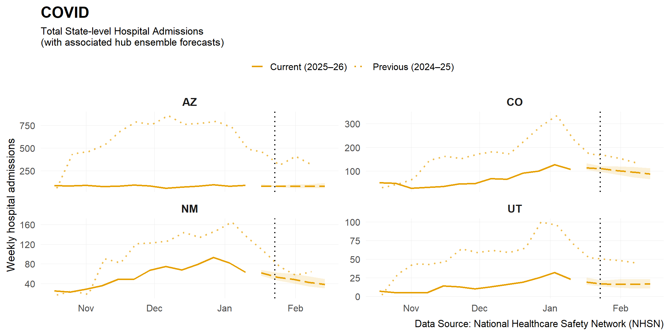
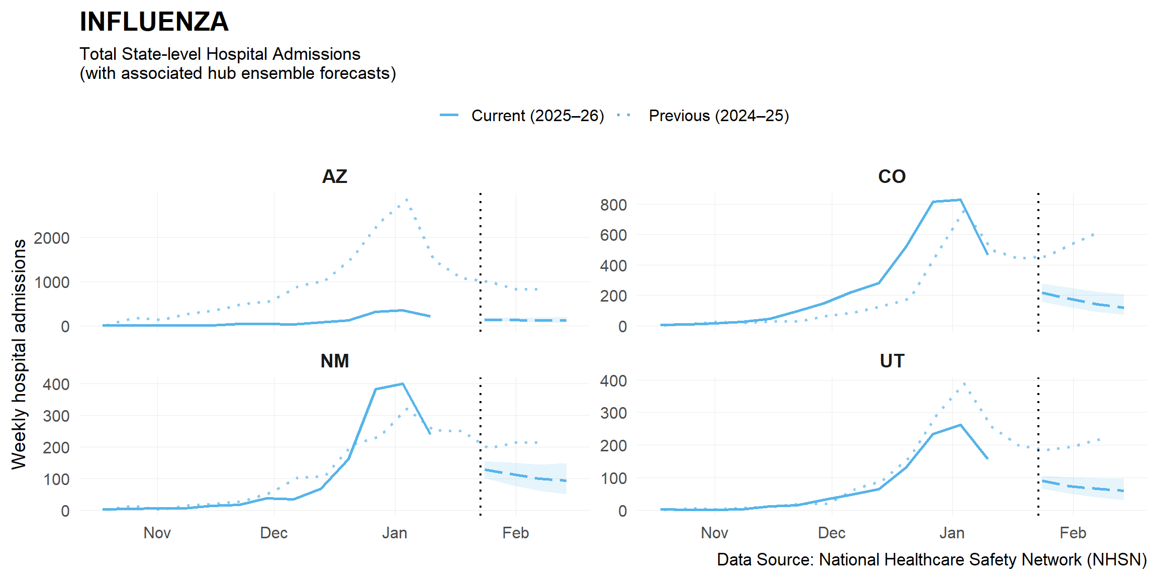
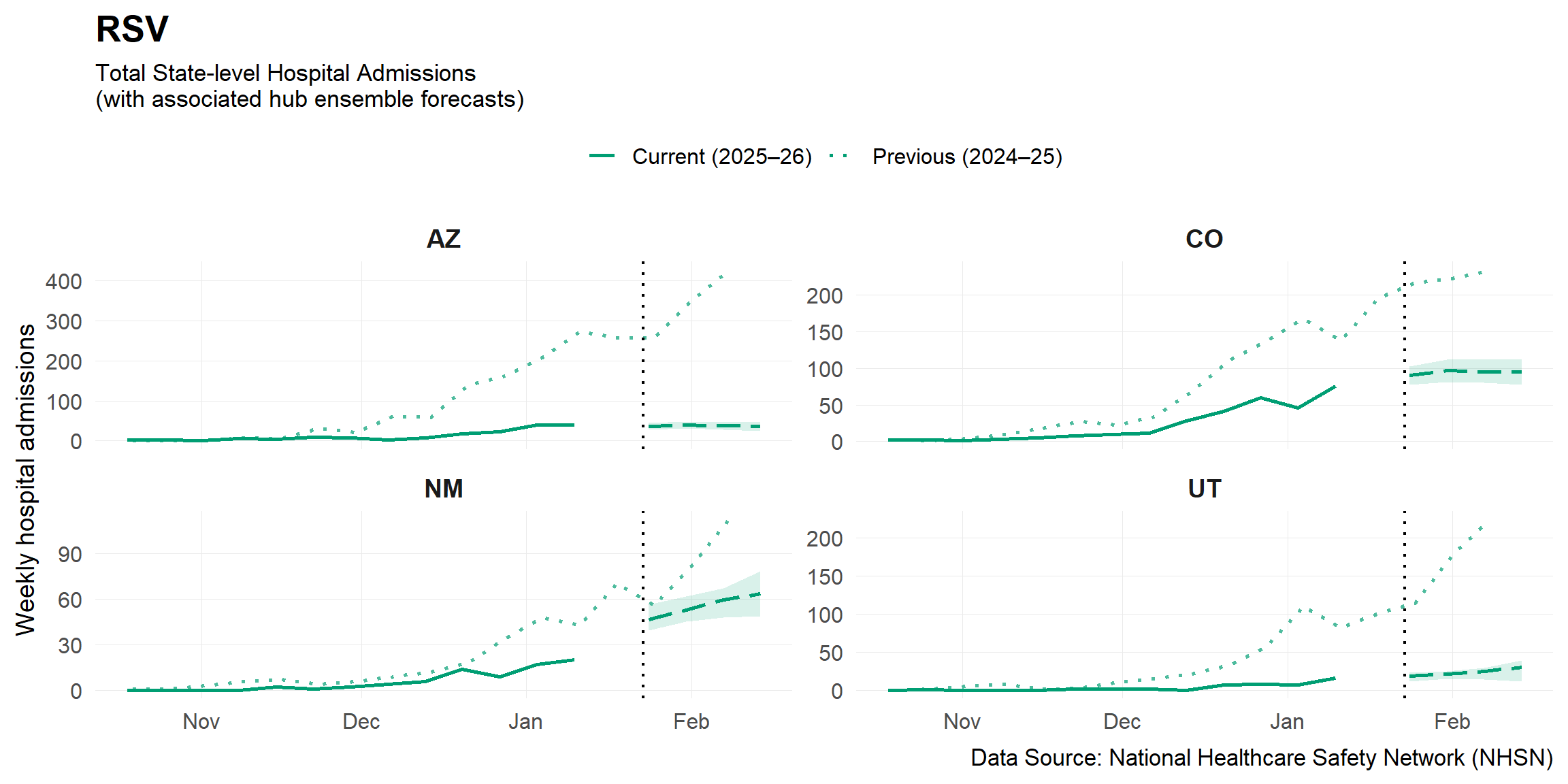
This figure shows trends in hospitalizations based on data from the
National Healthcare Safety Network (NHSN). Total number of weekly
hospital admissions per disease are reported and each state sub-chart
has a different Y-axis scale. Hospitalizations represent an estimate of
the burden of severe disease and impact on the on healthcare system for
each virus. Data from the previous season, represented with dotted
lines, are also shown for comparison. The dashed black vertical line
represents the current report date, but the most updated available data
may not be as recent.
Forecasts:
In addition, we have
included the most recent hub ensemble forecasts from each of the
corresponding collaborative hubs: COVID-19 Forecast Hub, FluSight
Forecast Hub, and RSV Forecast Hub. The hub ensembles are an average of
each of the contributed models to the hub, where the dashed lines show
the median estimated hospitalizations for the upcoming 1-4 weeks, and
the shaded region indicates the 95% prediction intervals. Hub ensembles
tend to be robust, as they incorporate insight from numerous teams and
models.